Logo Evolution

A well designed logo…
…will successfully express a company’s values as it’s a way to tell the story of your brand’s culture, behavior, and focus.
Your logo is how people recognise you and it helps express how you’re different from your rivals.
These statements are true, however, if your brand is strong and well established enough your logo can also evolve over time to reflect your growth or even send you off in a new direction.
Many iconic brands have redesigned their logos after becoming established. Some, like Walmart, want a fresh start, others, like eBay and Apple, outgrow their initial logos, and some brands, like Mastercard, change their focus. Also, a logo redesign may be reflective of the time, when an outdated design is brought up to date. What this should tell emerging brands isn’t that the logo is the be-all and end-all of your brand, but rather that a logo isn’t forever. It’s an ever-evolving thing, as is a business.
The soul cannot think without an image.
Aristotle
Examples of famous brands’ logos evolving over the years

Starbucks –
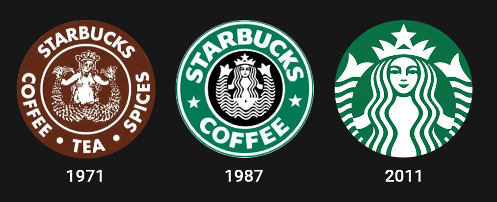
The original Starbucks logo had a seafaring theme as the name Starbuck comes from the first mate in the novel Moby Dick. The brand was invented by Howard Schultz and although someone else opened the 1st Starbucks store he went away and created a competitor named II Giornale which he ran up until 1987. Then in 1987 he bought back Starbucks and merged the 2 companies which is when the 2nd logo iteration came. This time they kept the Starbucks mermaid with her starred crown, but made her more contemporary. They also dropped the brown colour and used II Giornales more affirming green.

Mastercard –
Mastercard has dropped the word “Mastercard” from its logo.
Clearly confident customers will still recognise the brand simply by its interlocking circles. This works for established brands, such as Mastercard and Apple. But is a risky approach for a start-up.
The move comes as digital payments become more ubiquitous and Mastercard tries to get customers to view it as a ‘tech company’ instead of a ‘credit-card company’.
It reflects a changing landscape in payments. Customers are increasingly paying without a physical swipe or insert, but by inserting payment details or swiping a phone — and the word “card” might now feel a little old-fashioned.
Logos and branding are so important. In a big part of the world, people cannot read French or English but are great in remembering signs.
Karl Largerfeld


Comments are closed.